

An online form is the doorway that connects your customers with you. It’s a digital way of welcoming your customers into speaking with you. So in my book, forms have to be thoughtful and considerate. From several years of working in this space, today I am sharing best form designing practices in 2023
1. Form Structure and Fields
Before even starting to work on the design of the form, ask yourself, why is this form needed? Find a logical communication that the form should represent and then identify the fields absolutely needed for the same. Understand that the form is a kind of conversation that the user does with your app/website.
- Keep the Questions intuitive
- Maintain the right order to ask the questions which people would naturally respond to.
- Use simple and straightforward language.
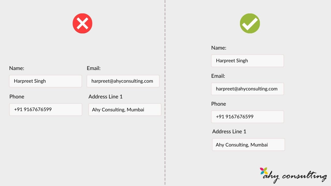
2. Maintain Consistency and Linearity
One website should have all the forms consistent. The design, colors, font, line height, letter spacing etc everything must be consistent throughout the website. A user shouldn’t experience two separate forms on the website to be entirely different in design and aesthetics.
Do not split the forms into two columns. Maintain one straight line with fields from start to finish top to bottom.
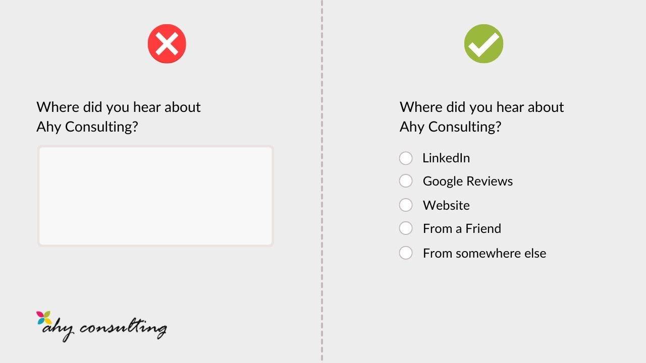
3. Reduce the input effort to the minimum
Minimizing the number of input fields makes your form less loaded, especially when you request a lot of information from your users.
But minimizing the number of input fields isn’t enough — you should also pay attention on user effort for data input. Typing has high interaction cost; it is error prone and time consuming even with a full keyboard (and even more so on a touch screen). Try to minimize typing and prevent users from making errors — use checkboxes, radio buttons or drop-down menus to restrict the number of options and for entries that can easily be mistyped.
4. Mobile > Desktop
More than 80% of online users browse internet using their phones. The forms must be first designed for mobile and then for higher screen resolutions. Prioritise the form UI and thoroughly test form fields and error message notifications on smaller devices.
5. Error Messages and its Timing
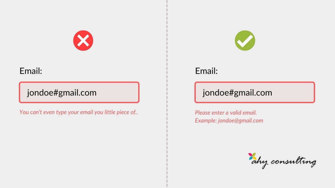
Provide clear and hard to miss error messages. To err is human and to gracefully handle them is good UX. You don’t necessary have to wait for the entire form to be filled and submitted to show the error messages. Instead, the best time to inform user about an invalid entry is immediately after they completed filling them.
Error messages should be visible and clear to understand. Red or any variant of Red is widely used and accepted norm to highlight invalid entiries. It’s best to not recreate the wheel by using some other color to do the job.
Make sure you don’t blame the user in your error messages.
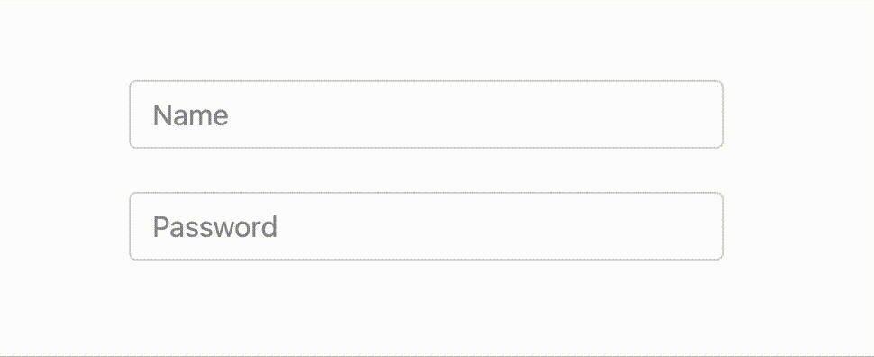
6. Do not remove field Label to save space

A lot of time marketing managers and even designers with a noble intentions to save space remove the Form field labels. And use placeholder text as a replacement of field labels. Placeholder text, located inside a form field, usually has a role of an additional hint, description, or example of the information required for a particular field. These hints typically disappear when the user types in the field.
Why this solution is bad:
- Once the user clicks on the text box, the label disappears and thus the user cannot double check that what he/she has written is indeed what was meant to be written
- When users see something written inside a text box, they may assume that it has already been prefilled in and may ignore it.
If you still have to absolutely remove field labels, I would suggest using dynamic placeholder labels which are still visible after they are filled as shown in the following example.
7. Reset Button in the forms is pure evil
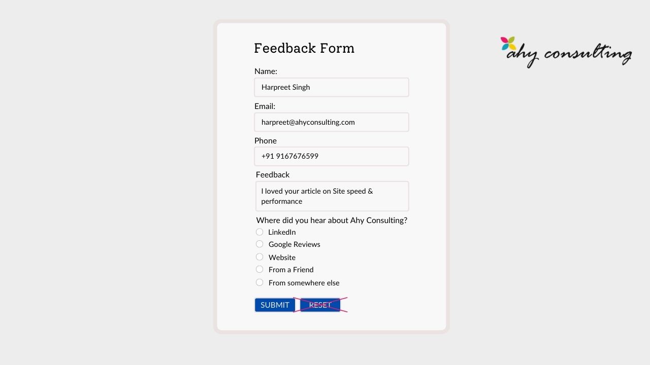
Avoid Reset buttons in your forms, it’s nasty and it has only created frustration and nothing more. The risk of accidental deletion outweighs the unlikely need to ‘start over’ on a web form.
Conclusion
No matter what type of business you run or work for, chances are you have at least one type of web form on your site. By applying these form design tips that enhance UX, as well as UI design, you’ll provide your visitors with a reliable and positive experience that helps you boost conversions. So, think about the forms that you need to include on your site and begin implementing design tips and takeaways that apply best to your business’ needs and goals.
Feel free to reach out to me if you need help with your project, using this link.
Cheers!